CLICK THE IMAGE TO PLAY!
(OPENS IN A NEW WINDOW/TAB)
.
COMMENTARY
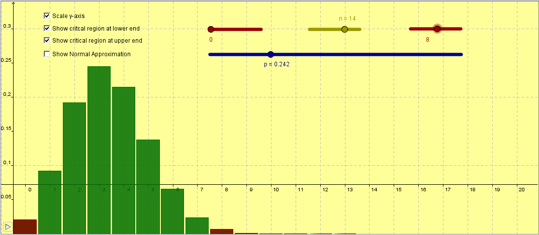
You will probably want to pause the animation – use the small button in the lower-left corner.
Scale y-axis – this is useful for reading probabilities more accurately.
Showing critical regions at either end – this just turns bars red – it is purely for visualising critical regions when performing hypothesis tests with the binomial distribution.


Aucun commentaire:
Enregistrer un commentaire